Q: What sparked the decision to rebrand?
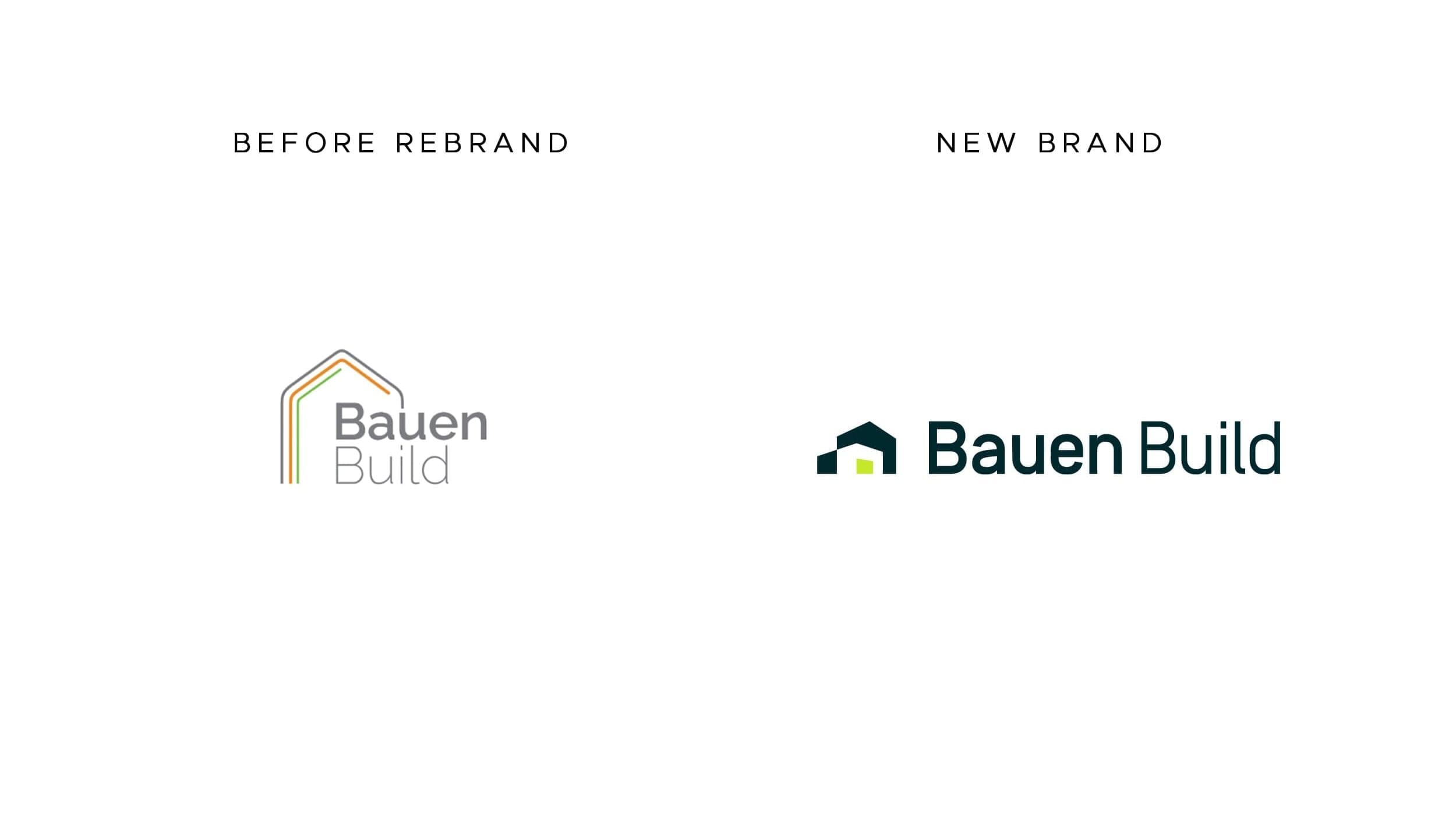
Last fall, we did some brand strategy and messaging work with John Franklin at Bear Peak Marketing, who led us through a process with clients, trade partners, and architects. It became clear that our visual identity (our logo, colors, typography) wasn’t matching the level of craftsmanship, collaboration, and detail we’re delivering on our projects. We wanted our brand to reflect not just what we build, but how we build: with a deep respect for both process and partnership.
Q: So this was about more than just a new logo.
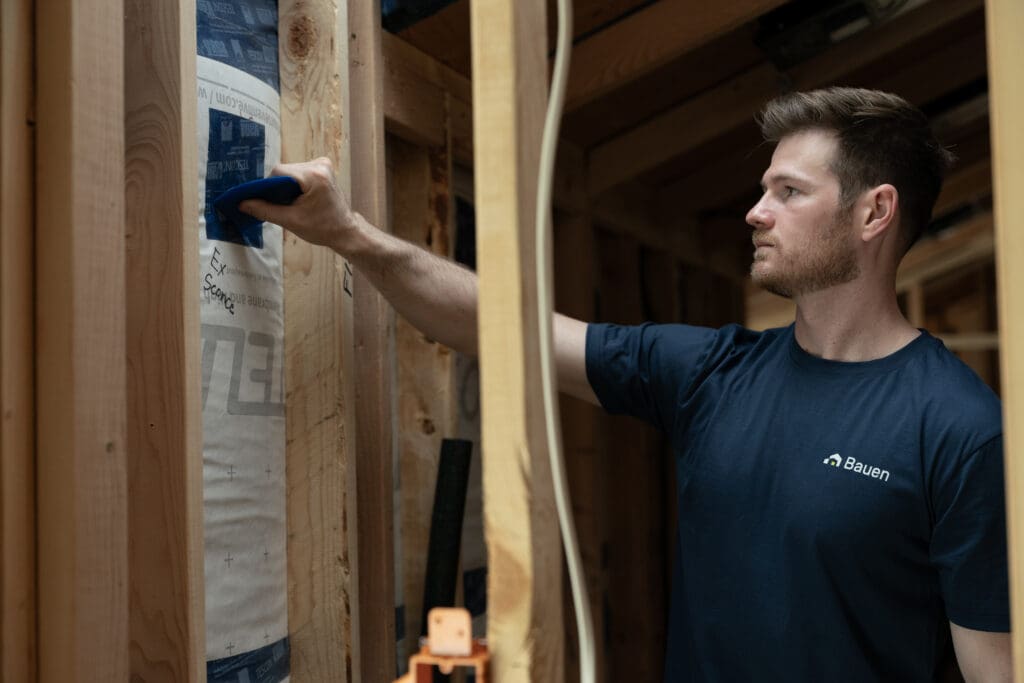
Absolutely. The logo is just the tip of the iceberg. This was about aligning every touchpoint (our website, house manuals, the way we show up on social media, etc) with who we are and what our clients experience when they work with us. We’re building high-performance homes that are also peaceful, long lasting, comfortable retreats. The new identity needed to convey that from the first impression.
Q: What were some design inspirations for the new brand?
One big one was Festool. They’re a German tool manufacturer known for obsessive quality and intentionality. It comes through in everything from their tools to their packaging to their website. We wanted a similar clarity and cohesion in our brand. We also took inspiration from brands like BMW and RBW (a lighting company in New York). BMW does an excellent job demonstrating the quality and performance of their vehicles in a succinct way on their website. RBW does an incredible job distilling the essence of what you experience when you add their products to your home. That’s what we’re trying to do with home construction.
Q: Let’s talk about how the new brand feels different. What do you see when you look at it now?
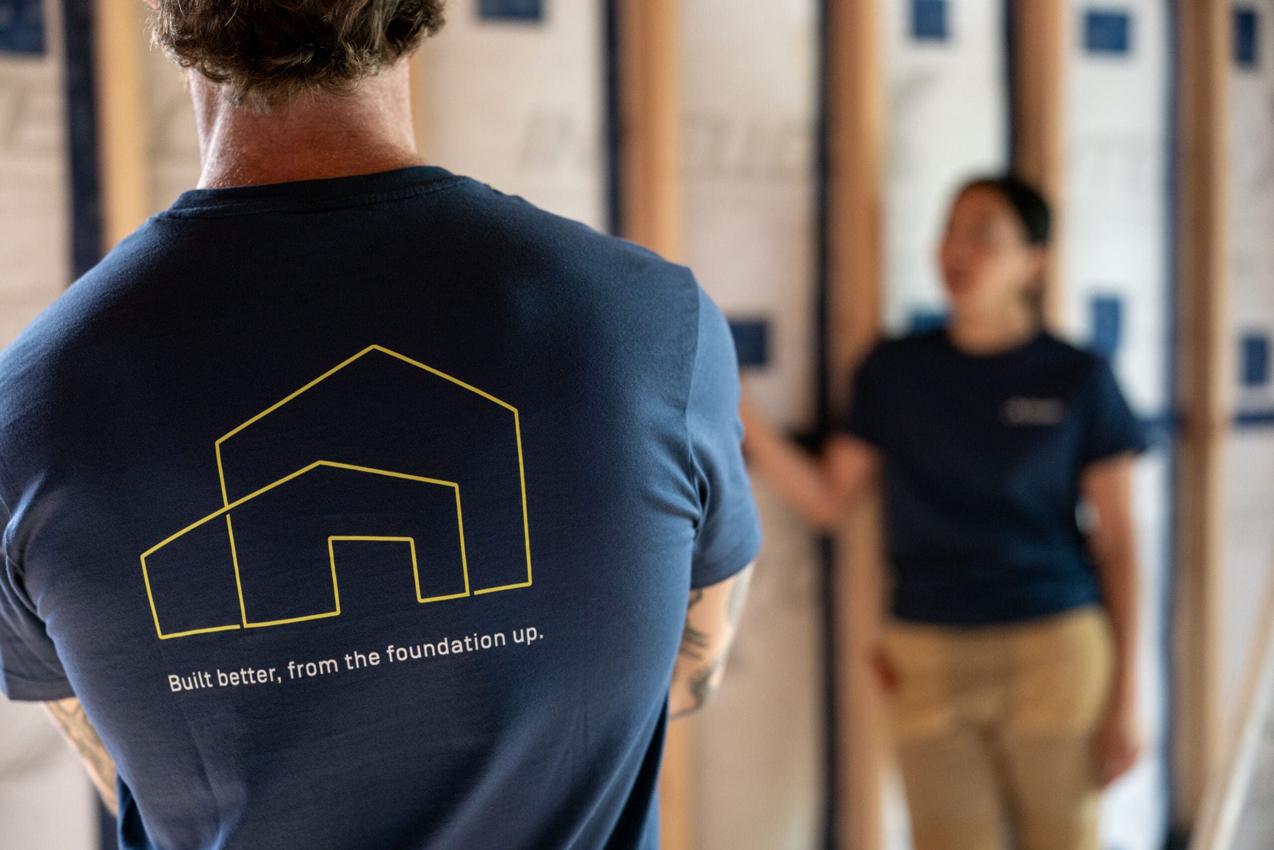
The new identity, developed with Folisi Design Studio, feels more resolved and enduring. It builds on the original brand I created in the early days—a straightforward, functional mark grounded in building science—but elevates it with greater clarity and refinement. It’s designed to grow with us and reflects the long-term thinking we bring to every project.
There’s a greater sense of confidence in the new system. The lines are cleaner, the typography more deliberate, and the overall look reflects the kind of work we’re doing today: precise, elegant, and built to last. It’s a better articulation of what we have been building for the past four years.
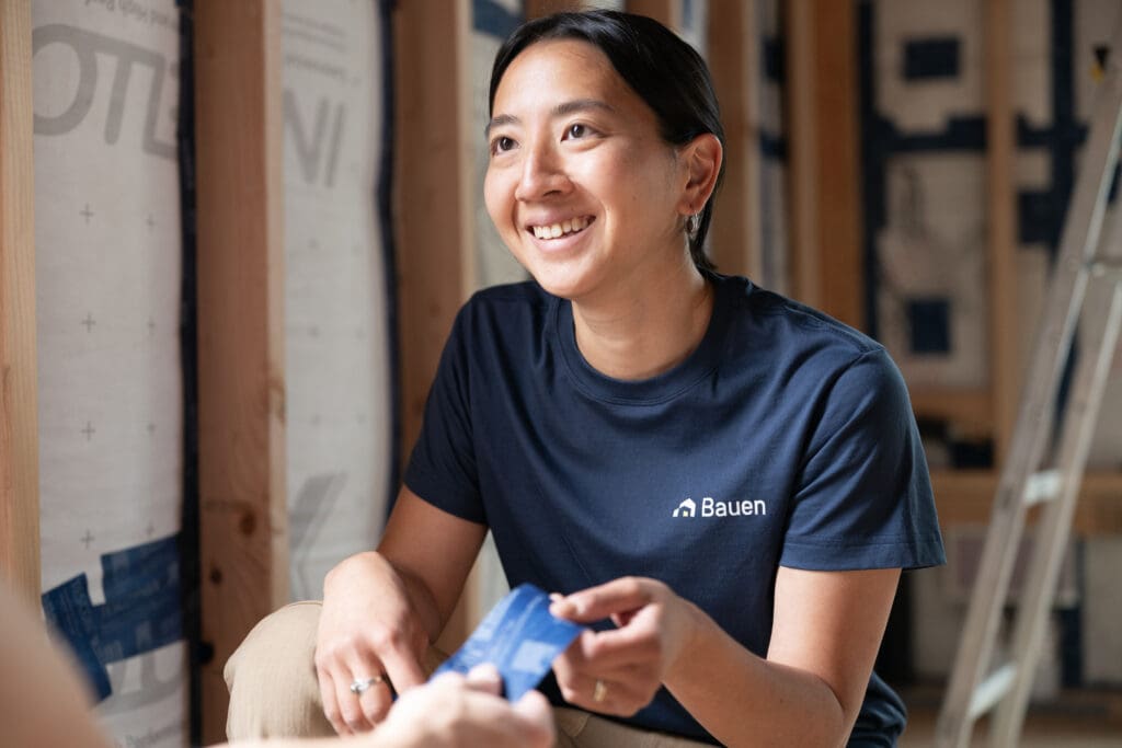
One thing we’re particularly excited about is that every project will now receive its own custom mark (logo). Building a home is a massive undertaking for the client and we believe each project deserves its own identity. These marks will appear throughout the build process, from signage on site to the personalized home care manual we hand off at the end. It’s a way to honor the uniqueness of each home and the care that went into creating it.
Q: How did you think about the look and feel of the new website?
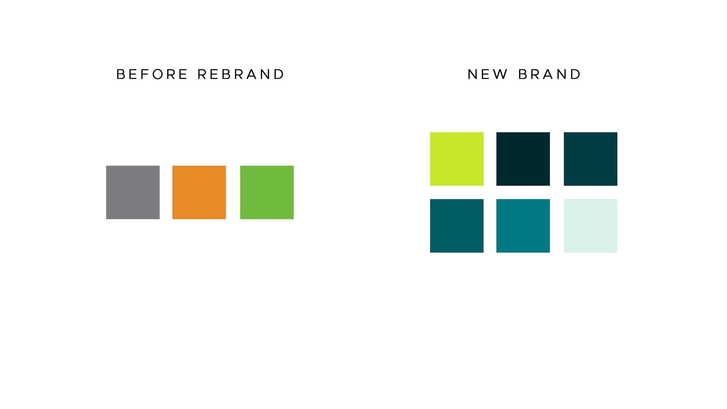
We chose a restrained color palette, mostly neutral, but with a few pops of color to reflect how we approach our work: grounded and detail-oriented, but also open, creative, and collaborative. Same with the fonts. We went through over a dozen options before landing on something that felt clean and timeless.
In addition, I love how the new website provides in depth highlights of the project, the products we used on each project, and the trade partners that helped us to make the project a reality. We were able to design the project pages with all of that information without making it overwhelming and keep the visitor’s focus on the project’s photos.
Q: What do you hope people take away from the rebrand?
I hope they feel the care we put into our builds, into our client relationships, and now into how we present ourselves to the world. I also hope the brand inspires trustworthiness and reliability.